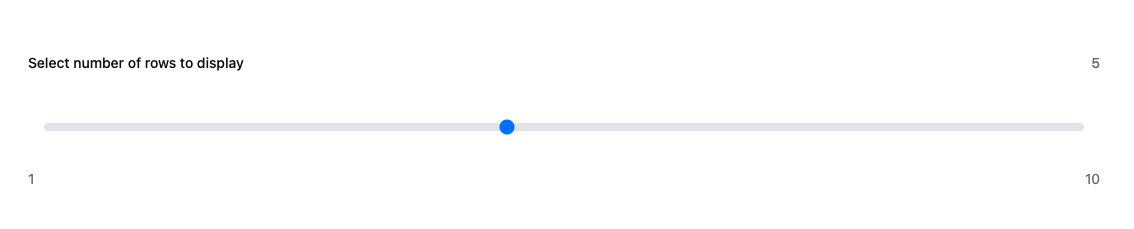
slider function adds an interactive slider to your app, enabling users to input numerical values within a specified range. This is especially useful for dynamic controls, such as selecting a range or adjusting parameters.
Parameters
label(str): The label displayed next to the slider, indicating its purpose.min_val(float): The minimum value the slider can take.max_val(float): The maximum value the slider can take.step(int): The step size between values on the slider.default(float): (Optional) The initial/default value of the slider.size(float): (Optional) The width of the component in a row. Defaults to1.0(full row). See the Layout Guide for details.
Returns
floatcontaining the current value.
Usage Example
Here’s an example of how to add a slider to your app:Key Features
- Customizable Range: Define the range of values with
min_valandmax_val. - Adjustable Precision: Control increments using the
stepparameter. - Default Selection: Set a sensible starting point with the
defaultparameter. - Real-Time Input: Values update dynamically as the user interacts with the slider.
Why Use slider?
Sliders provide an intuitive way to capture numerical input, enhancing user experience by making the interface interactive and responsive.
Simplify user input with the slider! 🛠️