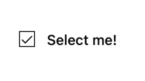
checkbox function adds an interactive check box to your app.
Parameters
label(str): The label displayed next to the checkbox, indicating its purpose.default(bool): (Optional) The initial/default value of the checkbox.size(float): (Optional) The width of the component in a row. Defaults to1.0(full row). See the Layout Guide for details.
Returns
bool:Trueif checked,Falseif not.
Usage Example
Here’s an example of how to add a checkbox to your app:Key Features
- Customizable Label: Set the label to distinguish between different checkboxes.
- Adjustable Default: Control the default state.